
Understanding Color Psychology
Color psychology is a fascinating field that explores how colors influence our emotions, behaviors, and perceptions. The colors we choose for our living spaces—termed the best color palettes for homes—can significantly affect our mood and the overall ambiance of our environment. Each color has unique psychological effects that can either uplift our spirits or evoke calming sensations. For instance, warm colors like red, orange, and yellow are known to stimulate energy and warmth. These shades can create an inviting atmosphere that fosters conversations and social interactions, making them ideal choices for living rooms and dining areas.
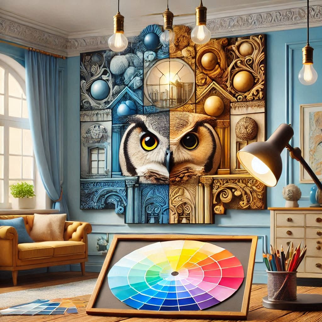
On the other hand, cool colors such as blue, green, and purple tend to elicit feelings of tranquility and relaxation. Blue is particularly effective in creating a serene environment, often associated with calmness and peace, making it an excellent choice for bedrooms or meditation areas. Green, reminiscent of nature, can help to promote a sense of balance and refreshment, which can be beneficial in spaces intended for relaxation and rejuvenation.
Neutrals like beige, gray, and white serve as versatile backgrounds that can harmonize various colors and styles. They provide a sense of stability and a calming effect, making them suitable for any room. When exploring room color ideas, it’s essential to consider how these colors interact with each other and the overall design of your home. The psychological impact of color extends beyond aesthetics; it directly affects our daily lives and well-being. Therefore, understanding color psychology is crucial for selecting the best color palettes for your home, ensuring they resonate with your personal style while meeting your emotional needs.
Creating Inviting Living Rooms
The living room serves as the heart of any home, where family gatherings and entertaining guests take center stage. Consequently, selecting the best color palettes for homes, particularly in this communal space, is crucial to establishing a welcoming environment. The psychology of home colors plays a significant role in how one feels within a room, influencing mood and interaction.
For a truly inviting atmosphere, consider integrating warm tones such as soft oranges, muted yellows, and rich browns. These colors evoke feelings of comfort and warmth, making them ideal for fostering coziness during family gatherings. Earth tones, characterized by shades of beige, taupe, and terracotta, can be combined with splashes of cheerful accent colors like vibrant turquoise or sunny gold. This combination not only enhances the inviting nature of the space but also introduces a sense of energy and liveliness, making conversations more engaging.
On the other hand, incorporating cool hues, such as soft blues and greens, can create balance within the living room. These colors are often associated with calmness and tranquility, providing a refreshing counterpoint to warmer tones. Blending neutrals with vibrant colors presents yet another remarkable option; for instance, pairing a serene gray backdrop with pops of emerald green or coral can stimulate both conversation and connection among guests while retaining an air of sophistication. Such room color ideas reflect elegance while also embracing comfort, effectively achieving a dual purpose.
Ultimately, when curating color palettes for your living room, strive for combinations that invite interaction while ensuring the space remains soothing and visually appealing. By thoughtfully selecting your colors, you can create a harmonious environment that not only invites warmth and connection but also contributes to the overall enjoyment of your home.
Crafting Serene Bedrooms
Creating a tranquil bedroom environment is essential for promoting restful sleep and fostering intimacy. The choice of colors plays a critical role in establishing this serene atmosphere. Soft, calming color palettes, such as pastel shades and cool tones, have been proven to relax the mind and body, aiding in emotional well-being. For instance, light blues and gentle greens evoke a sense of peace, mirroring the natural elements of sky and water, which can help lower anxiety levels. These hues are often regarded among the best color palettes for homes dedicated to relaxation.
In addition to these base colors, accents can be strategically integrated to enhance the warmth without overwhelming the calming effect of the primary tones. Consider incorporating soft yellows or muted corals as accent colors. These hues not only infuse a sense of coziness but also stimulate feelings of happiness and comfort, essential for an inviting bedroom. Thoughtfully selected room color ideas, such as pale lavender or sandy beige, can complement the overall theme while reflecting a personal touch that resonates with one’s individual sense of calm and comfort.
Understanding the psychology of home colors is vital when making these choices. For example, while darker shades may evoke sophistication, they can also lead to feelings of confinement, particularly in smaller spaces. It is advisable to keep the darker hues to a minimum and use them sparingly, perhaps as a focal point on one wall. The essence of a peaceful bedroom lies in balancing these tones to maintain a harmonious environment. By adhering to these principles, one can achieve an effective layout that not only satisfies aesthetic preferences but also enhances relaxation and restfulness.
Maximizing Productivity in Offices
Creating an effective home office environment is crucial for enhancing productivity and focus, and the choice of color palettes plays a significant role in this endeavor. The psychology of home colors suggests that different hues evoke varying emotional responses and can influence our behavior and concentration levels. For instance, incorporating shades of blue in a home office is often recommended for its calming effect, which can help to improve focus and promote a sense of serenity. This color not only aids concentration but also reduces stress, making it a prime choice for those looking to enhance their productivity.
In contrast, the color yellow is known to stimulate creative thinking and encourage innovative ideas. It radiates warmth and positivity, thus fostering an energetic atmosphere that can lead to increased motivation and inspiration. Combining these colors strategically in your workspace can create a balanced environment. For example, using blue as the dominant hue with accents of yellow can promote a harmonious blend of focus and creativity, essential for any productive session in the home office.
Moreover, the combination of neutral colors such as whites, grays, and beiges can serve as a perfect backdrop, allowing brighter shades to stand out without overwhelming the space. These neutral tones can help maintain a sense of calmness while supporting effective organization, thus helping you to stay on task. To further enhance the workspace, it is beneficial to incorporate personal elements that inspire you, like artwork in your chosen color schemes. Ultimately, the best color palettes for homes, particularly in office spaces, can significantly influence your daily work performance, making it vital to choose colors that best suit your professional needs.


